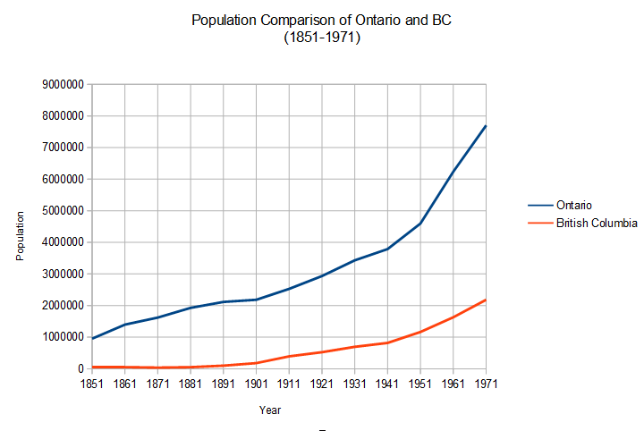
This graph compares the population of Ontario and British Columbia between the years 1851 and 1971. As is easily seen in the graph, the population in Ontario is far greater than the population in British Columbia. This is easily explained by the fact that when the Europeans originally started to colonize North America, they had to sail across the Atlantic Ocean which is on the east side of North America. Then slowly, as people began to move west the population grew in BC.